We’ve chatted a bit about omnichannel in the past – but we’ve yet to explain how we go about it in our omnichannel contact center solution. Let’s rectify that situation, shall we?
It’s pretty plain that omnichannel isn’t a trend (ugh). It’s a critically important shift in the contact center paradigm, and if you’re not getting it right you’re not going to be around much longer.
But before we get into the thick of our omnichannel contact center software, let’s cut through a common mix-up.
Omnichannel vs multichannel – what gives?
This has been dealt with in a few places, but it continues to be a sticking point for many. But look, it’s real simple.
Multichannel involves dealing with, y’know, multiple channels in isolation from one another. Each has a dedicated queue and dedicated agents, in other words.
Omnichannel, on the other hand, does not segregate any channel. The point is that all agents in the organisation can pivot between any channel as and when it makes sense.
Forget multichannel, basically. Omnichannel is where it’s at.
Now: how do we go about it?
Whether we realise it or not, we’re basically doing omnichannel in our everyday lives all the time. How often do you switch between WhatsApp, email, facebook and a phone call? This writer regularly skips between these channels, in one conversation even – because some interactions are best handled over a particular channel.
The thing tying all these interactions together is context. It’s possible to have an uninterrupted conversation with somebody across all these things because, well, they’re friends and hopefully neither party suffers from severe short-term memory loss?
How do you transfer this experience across to a contact center?
With lots and lots and lots and lots of arguments.
No but seriously it was hard
But it comes down to this: centralise the access to your channels and make it real easy to access the context of a conversation.
It turns out that this is quite tricky, because that’s a lot of information to cram onto one screen. Especially considering that monitors are usually not infinitely large.
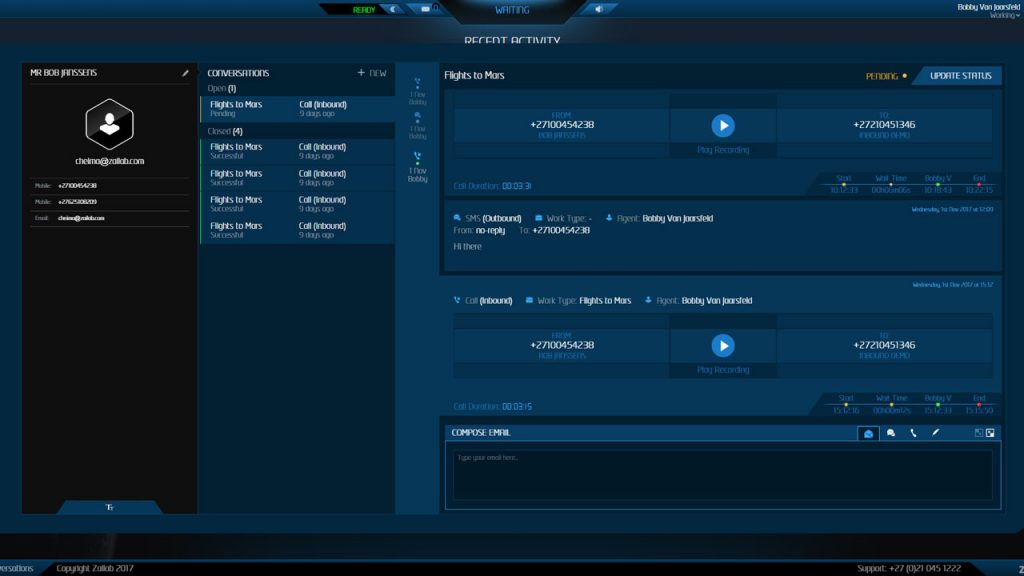
Let’s take a look at what we’ve got on the contact card – the screen from which all customer interactions are handled.
The contact card
When we first redesigned the contact card for our omnichannel contact center software – back then called the conversation card – we immediately ran into issues. ‘We used to show agents one conversation at a time on the card,’ says Zailab business analyst Susie Gardiner. ‘As we went on we realized this wasn’t the best way to show agents a holistic picture of the customer. Because once you’re in there you don’t have the context of historical conversations.’
Trying to fit expand the old design to accommodate multiple conversations proved tricksy. ‘I wouldn’t say it was a mess, but it was confusing,’ Susie says. ‘There were elements all over the card, and it wasn’t intuitive.
‘So as we went along we thought, okay, let’s try something different.’
So they did.
Make it readable
The first thing you’ll notice is that everything flows from left to right, pretty much in order of detail. The left-hand column of the screen shows the customer’s vital info – their name and contact details. (It’s worth noting the phonetic alphabet tab at the bottom.) Immediately to the right of this is a list view of all conversations (open and closed) your organisation has with this customer.
‘The interaction timeline and the customer journey were made our core visuals,’ says designer Darren Croxford. With these in focus it’s basically impossible to get lost.’
So when you highlight a conversation it will expand, on the right, into the linked list of interactions that are bundled into that conversation. Any of these can be selected to view the interaction, be it reading an email or listening to a call recording.
These succinctly present all the contextual cues an agent needs to have a meaningful, efficient conversation with a customer, even if this is the first time they’re dealing with that customer.
‘When we started wireframing I used Gmail as a point of reference,’ Darren says. ‘Gmail has become pretty much a standard flow for the eye to follow. We read from left to right, so every click guides you into something that feels very natural.
Tools of the trade
Savvy readers out there will notice we’ve used the Pareto principle (otherwise known as the 80/20 rule) to keep the contact card clutter-free; which is to say, 80% of the time the agent will only need 20% of the information (loosely speaking, of course) we could show them. That means we strive to hide the details that could prove distracting when they’re not called for.
‘We do everything we can to ensure people don’t have to leave the page,’ Darren adds. ‘The second you leave the page, people get lost.’
This extends to the bar of omnichannel contact options beneath the interaction history view. Every channel available to the agent is arranged in a single, easy-to-navigate space. Initiating an interaction – even if you’re, say, already talking to that person on the phone – is extremely straightforward.
Clutter is kept to an absolute minimum, and although the bar takes up only a fraction of the screen it’s possible to expand it dramatically.
‘We put a lot of thought into the omnichannel widget,’ Darren says. ‘It was quite neglected in the past, but this workspace that you type in is way more important than many of the other parts of the view. The fact that it can expand to nearly full-screen makes a big difference to its usability.’
We’re very proud of the beastie. It’s a lot of complexity wrapped up into a deceptively straightforward package, and we like to think we did a pretty damn great job.
Learn more about our cloud-based omnichannel contact center solution here.